Good evening! I hope everyone's week has started off well :) Mine, not so much, as I sit awaiting to find out if I get called in for jury duty. I was off the hook for today, and tomorrow as well, but I'm officially on stand by all week. Boo >.>
So, to brighten my mood, I thought I would share with you a comparison of two pink neons. When I did this, months ago, I only had the two, I believe. I've since added a few more, which I'll compare all them at a later time.
For tonight's comparison, I offer you China Glaze Pink Voltage and Sinful Colors 24/7. I know for a fact they aren't the same; you can see that immediately just by bottle comparison.
Aside from them both being pink, neon, and needing 4 coats for opacity, that's where the similarities end. Pink Voltage has a shimmer to it when topcoated, and a blue flash that translates from bottle to nail. 24/7 is lighter than Pink Voltage, has no shimmer, in fact when topcoated it's just a pink neon creme. Like all neons, these dry matte and do need to be topcoated.
24/7 is swatched on my index and ring fingers, Pink Voltage on the other two, outdoors with no flash. Four coats and no topcoat.
My opinion: you could get away with having both, since they are different enough. Of course, if you're a pink lover, you'll get both anyways :P Lol
Good evening!
Today is normally Stamping Sunday, which I did do this week. However, I didn't care for the choices to vote on, so I didn't vote. I kinda decided last minute yesterday what I was going to do.
See, I just got two more plates from Messy Mansion, her Easter themed plate , MM 08 and her floral themed plate, MM 07. It was MM 07 that I picked to do. For my base color, I did 2 coats of Zoya Shelby topped with Seche. I first stamped the leaves, in Sinful Colors Exotic Green, then the roses with Sally Hansen Insta Dri Quick Brick. The Seche kinda smeared some of the roses but I think it still looked nice.
At least for now!
Good evening! I don't have today's mani to show you, because, again, I wore a color I've already shown, and I didn't do anything different with it. If you're curious, I had Zoya Chyna on my tips.
Instead, I'm going to show the last of OPI swatches. There's just 5 of them, so sit back and enjoy :)
Starting off is The "It" color. This is a golden yellow that's very jelly like. It's not streaky like most yellows, but I still needed 4 coats for opacity.
Next up is Pamploma Purple. Pamploma Purple is more a berry purple than a regular purple, like Funky Dunkey. It's definitely a one coater, even though I did two for this swatch, and it's perfect for stamping.
In that same vein, Lincoln Park of Dark is also great for stamping. It's a blackened red creme that can be a one coater.
Alrighty, next is my other glow in the dark, Glow-ink in the Dark. It's kind of a purpley blue color that dries matte like Zombody to Love. My swatch was done with 4 coats.
Lastly is Russian Navy, the original. RN is interesting; it definitely looks like a purple shimmer in the bottle, but on the nail, it looks to be blue, and when you take it off, it looks green. It does stain. My swatch is 2 coats.
So there you have it! The last of the OPI swatches. I do have other brands that will get shown, too.
Good evening!
I have some swatches, of the same color, to show you tonight. I managed to pick up OPI's Eurso Euro last week :) I'm glad I did, since it isn't like any of the blues I have.
The first two pics are 2 coats of it alone, the next two show it with one coat of Polka.com over, and the last two are with it matted. Eurso Euro is almost a one coater, but not quite, and it didn't stain!!
Good evening!
Apologies for not posting yesterday's mani. I loved my swatch of OPI's Tiffany Case so much, that I did a full mani with it, on top of my being tired and too lazy to post last night xD
I do have today's mani to show you, though. I haven't done a French in ages, mainly because I don't care for traditional Frenches; they're just too boring for. What I did today wasn't boring, at least not in my opinion. I started with just a single coat of OPI's Rosy Future and topped with Seche. I let that dry well, then got out my Scotch tape.
I taped off my nails just below my smile lines and applied a thin coat of OPI's Solitaire. I didn't topcoat over Solitaire, I just left it as it was. This was prolly one of the prettiest manis I have done, and one of the simplest :)
Good evening!
I'm sitting here watching one of my all time favorite movies, The Wizard of Oz, as I type up this post :) I love it, and haven't seen it in years, literally. I remember watching it at least once a year as a child. It's just such an awesome movie.
Anyways! On to the post. I wanted to show you all a couple of neon turquoises that I thought were the same, China Glaze's Turned Up Turquoise and Wet 'N Wild's Distant Memory from the Spoiled line.
In the bottle, they look pretty similiar. They both have a bit of shimmer, which you can't see in this pic, but it's visible on the nail.
For my swatch, I applied three coats of each, which is what was needed for opacity. You can definitely tell the difference now. Distant Memory is darker and dries to a smoother finish, whereas Turned Up Turquoise still looks streaky (although topcoat takes of that). They both dry to a satiny matte finish that needs to be topcoated so it doesn't chip; you could leave it as is, though. All neons dry to a matte finish, so these are no different. TUT is on my index and ring fingers, while DM on the other two.
My opinion: you don't need both unless you really love neon turquoises. They're just too close to justify having both in your collection.
Good evening!
Normally, I would be showing you all my Stamping Sunday nails. Today's challenge theme was Earth Day, which is tomorrow. I had a great idea, had the plates and colors all picked out..... It should have looked great, but it didn't. In fact, I was so disappointed with it that I didn't take any pics before taking it off earlier this afternoon and decided to show you swatches instead.
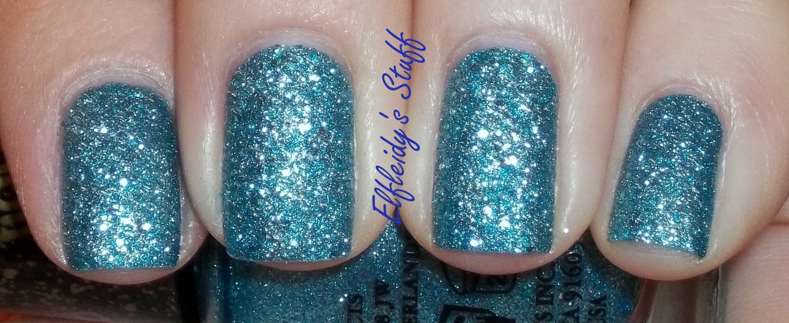
The swatches I have tonight are three of OPI's Liquid Sands, one from the Mariah Carey collection and 2 from the just released Bond Girls. First of all, let me just say I love textured polishes. I mean, come on, I have a ridiculous number of Shatters and Crackles and quite a few matte topcoats and polishes. It was only natural that I would want to try the Liquid Sands.
Second, there are a couple of different formulas for textured polishes. For example, I believe most or all of the Mariah Carey Sands are matte glitter (I don't know as I only have the one). The Bond Girls Sands appear to be a cross of matte glitter and foils. Zoya Pixie Dusts are matte glitters that are matching glitter and base colors. Milani has a line of textured cremes that look like a popcorn ceiling and just look nasty to me. Some people may like them, I don't. I much OPI's and Zoya's take on the textured polish trend.
The Sand I have from the Mariah Carey collection is Got Your Number, because, well, it's blue. It has mixed sizes of holo glitter suspended in the blue base. My swatch needed 3 coats because I could still see VNL after 2 coats. I was worried about how this would feel once it dried, if it would make me crazy and I would pick at it, but it didn't bother me. It is a little rough, but not the point of snagging my hair or clothes.
I also didn't have a problem with staining with this color. Acetone is recommended for removal, since it's basically glitter.
Next up is Bond Girl Solitaire. I love a good white polish, especially if it's not your ordinary white. Solitaire is absolutely gorgeous. It's a white foil with white and silver glitter. It's not a blinding white, it's a dazzling, sparkling white, like a solitaire diamond :) This is two coats.
The other Bond Girl I have is Tiffany Case, because, well, it's blue lol. I'm blown away by this color, it practically glows on my skin, it's so complementary to it. Tiffany Case isn't so much blue as a bright aqua foil with matching glitter. I love this one so much, I'm still wearing it on my pic hand as I write this :P My swatch is 2 coats.
Good evening!
I have more swatches for you, lol. Tonight, it's just a glitter swatched alone and over other colors. For you eyes, I bring OPI's Fresh Frog of Bel-Air. It's green and silver glitter suspended in a clear base. It's not a dense glitter so you would need several coats for complete coverage, however I think this is best either layered over another color or used in a jelly sammich.
For my swatch, I did 3 coats of it alone, and 2 coats of it layered over OPI's Skip the Giftwrap and Rinse Charming. I was sorely tempted to swatch it over red, but people seem to have a problem with red and green together lol.
Good evening and happy Friday! Any big plans for the weekend? About all I plan on doing is getting my hair cut tomorrow, then coloring it Sunday. That's it :)
Today's mani was inspired by the skirt I wore today. It's a colorful paisley print, below-the-knee skirt with a beaded fringe. It has several different colors in it, including purple, which I picked as my base color. So, two easy coats of Zoya Carly and a coat of Seche left to dry.
Flipping through my selection of plates, I couldn't find a true paisley print image. The closest I found was Shany 20, so that's what I used stamped with Wet 'N Wild French White. Topped it all with another coat of Seche and done.
Goooood evening, everyone!
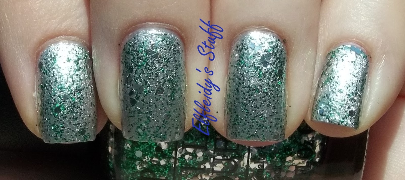
I have some more swatches for you tonight. This batch, at least, is from a newer collection, OPI's Euro Centrale. When I first saw the press release for this collection, I was like, wow, I want them ALL! Once I saw them in person, though, I was decidedly meh. The only colors I ended up wanting are the ones I'm about to show you, plus one more I plan on getting, just because it's blue xD
The colors I want to show you are Can't Find my Czechbook, You're Such a Budapest, and Polka.com. First of all, I love all three of these, they work well together. Second, these say summer to me more than spring; actually, the entire collection does, but that's beside the point.
Up first is Can't Find my Czechbook. This is very pretty, lighter turquoise creme that's very similiar to OPI's Fly. It's not as dark, but just barely. Held up together, you can tell the difference. Do you need them both? Prolly not unless you're like me lol. I needed three coats for my swatch because I kepy putting bald spots in my application xD Best part, it doesn't stain.
Next is You're Such a Budapest. I love love love the color of this one, hate formula unfortuntely. When you first see this one, you think, oh, what a pretty purple creme! Budapest is not a creme, it has a really subtle shimmer to it. Sadly, though, it is very thin and streaky. My swatch needed 3, somewhat thicker coats, and I'm not sure if that was enough. I personally can't tell if there are any streaks or not in my swatch.
I wouldn't even call this a true purple, but a periwinkle, like the color of tanzanite. You can kinda see the shimmer in my swatch, so as much as it's a bitch to apply, I think the color is worth it.
And lastly, there's Polka.com. This is the glitter in the collection, and orginally, I wasn't going to get it. But's it's a blue/purple/fuschia glitter and something I don't have. The glitters are suspended in a clear base, with finer blue glitter mixed in. You could wear it alone, but it definitely looks better layered. I swatched over the other two colors, with 2 coats, and by itself, also 2 coats.
And there you go! These are my picks from the Euro Centrale collection. I fully intend on picking up Eurso Euro, but nothing else =\ None of the other colors really speak to me, but I think that's more because they're just not good colors for me.